Care given a face, a color, and a smile.
Challenge
Clínica Conmtato arrived with a strong concept — whole-person health, body and mind — but no face to carry that sense of care. The challenge was to build an identity that spoke of closeness and human contact without falling into the cold, impersonal clinical blue cliché.
Concept
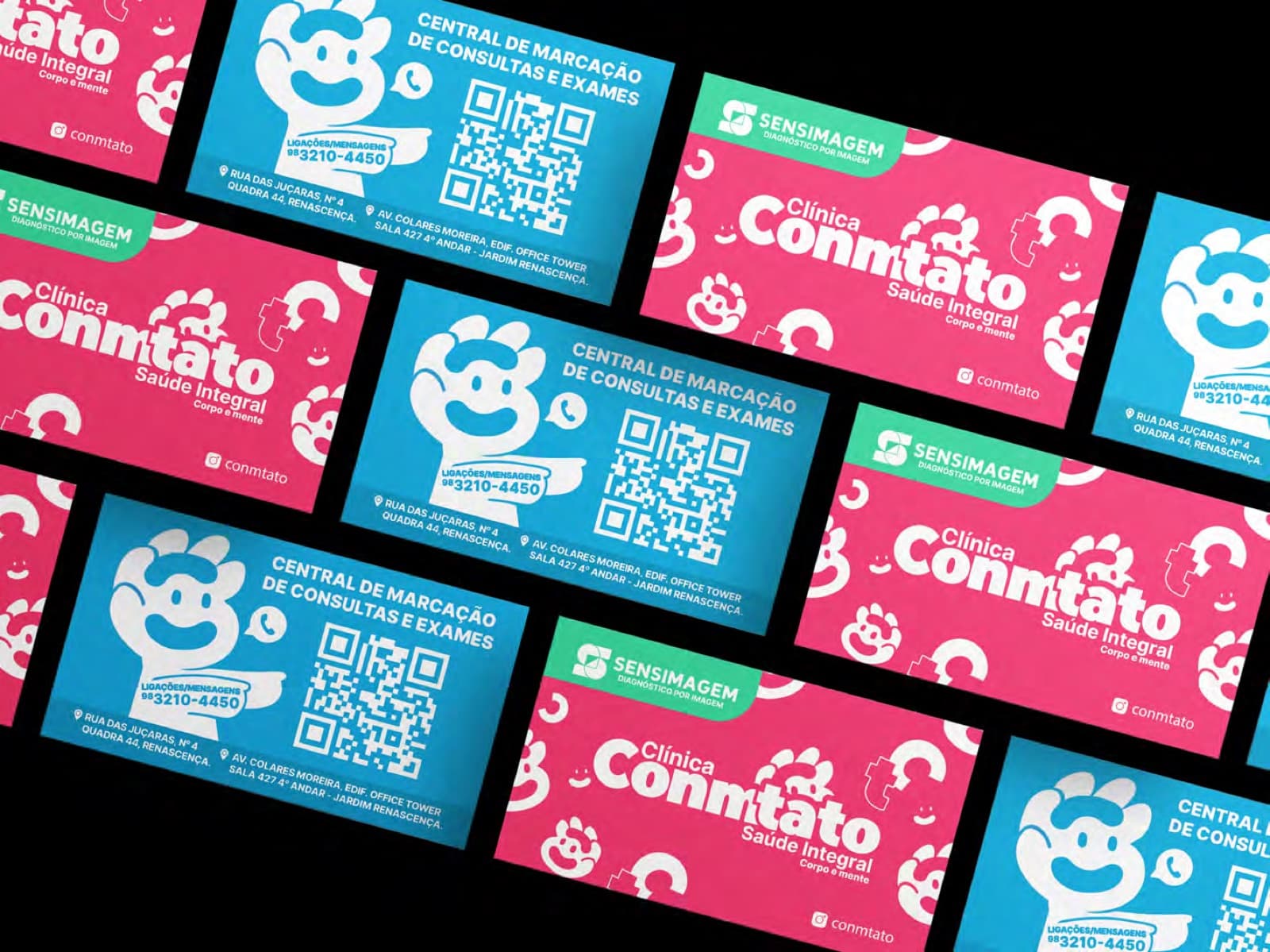
We started from the name itself: Conmtato. Contact is touch, presence, people caring for people. We designed a warm, inventive visual world anchored by a smiling-faced mascot that humanizes the brand and becomes an instant point of recognition.
System
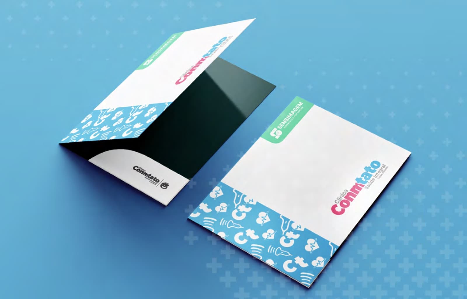
Soft shapes, friendly type, and a vibrant pink-and-blue palette that signals closeness, trust, and professionalism all at once. A pattern of health icons gives the system texture and range, holding the brand together across any application.
Application
From the logo to the stationery — cards, prescription pads, and folders — every piece was built to reflect the clinic's identity. The result connects care and well-being in a single, coherent, memorable visual experience.
Identity in use